

Top 5 colour palettes we're loving for brands right now…
A brand's colour palette isn't just aesthetic, it’s a non-verbal communicator. In an instant, colours convey mood, values and personality, defining how your audience experiences your brand. The right mix can evoke trust, energy, sophistication or warmth (and the opposite is true for the wrong mixes too!…)
Here at S+CO., we're constantly scanning the visual landscape, looking at the emerging trends and sense-checking what resonates with consumers. For this week’s post, we decided to show you our five favourite brand palettes: they’re versatile, compelling and offer a powerful way to tell your brand story. Like what you see? Stick around to the end to find out how we can go about defining (or refining) your brand’s palette.
ONE: EARTHY TONES TWO POINT OH.
Say goodbye to the sterile beiges of yesteryear: this palette is an evolution that feels both grounded and modern. The pairing of a soft, warm sage with a desaturated clay creates a sense of comfort without being boring.
Why it works: It feels authentic and sustainable, aligning perfectly with the rise of eco-conscious consumerism. The sage brings a calming, natural energy, while the clay provides a stable, earthy foundation.
Best for: Wellness brands, organic food companies, sustainable skincare, cosy cafes and architectural practices.

TWO: SUNSET
This palette is pure optimistic energy. We love the juxtaposition of a high-energy blue against a soft, glowing sunset peach. It creates a high-contrast but surprisingly welcoming experience.
Why it works: It’s dynamic and vibrant. The blue grabs attention (essential in a crowded feed), while the sunset peach adds a human, approachable counterpoint, preventing it from feeling sterile. It screams “we are innovative, but here to connect.”
Best For: Tech startups, fitness brands, forward-thinking non-profits, creative studios and innovative FMCG companies. It’s perfect for brands with a confident, modern message.

THREE: THE NEW LUXURY
Forget the traditional black-and-gold… that’s a legacy luxury that can sometimes feel inaccessible. The palette we’re obsessing over is richer, warmer and slightly more weathered: a deep, velvety espresso brown paired with a quietly sophisticated oxidised copper.
Why it works: This combo suggests history and curation rather than shiny perfection. The espresso is grounded, stable and warm, while the oxidised copper is rich and confident.
Best For: Boutique hotels, artisan roasters, vintage furniture shops, curated lifestyle brands and premium spirits.

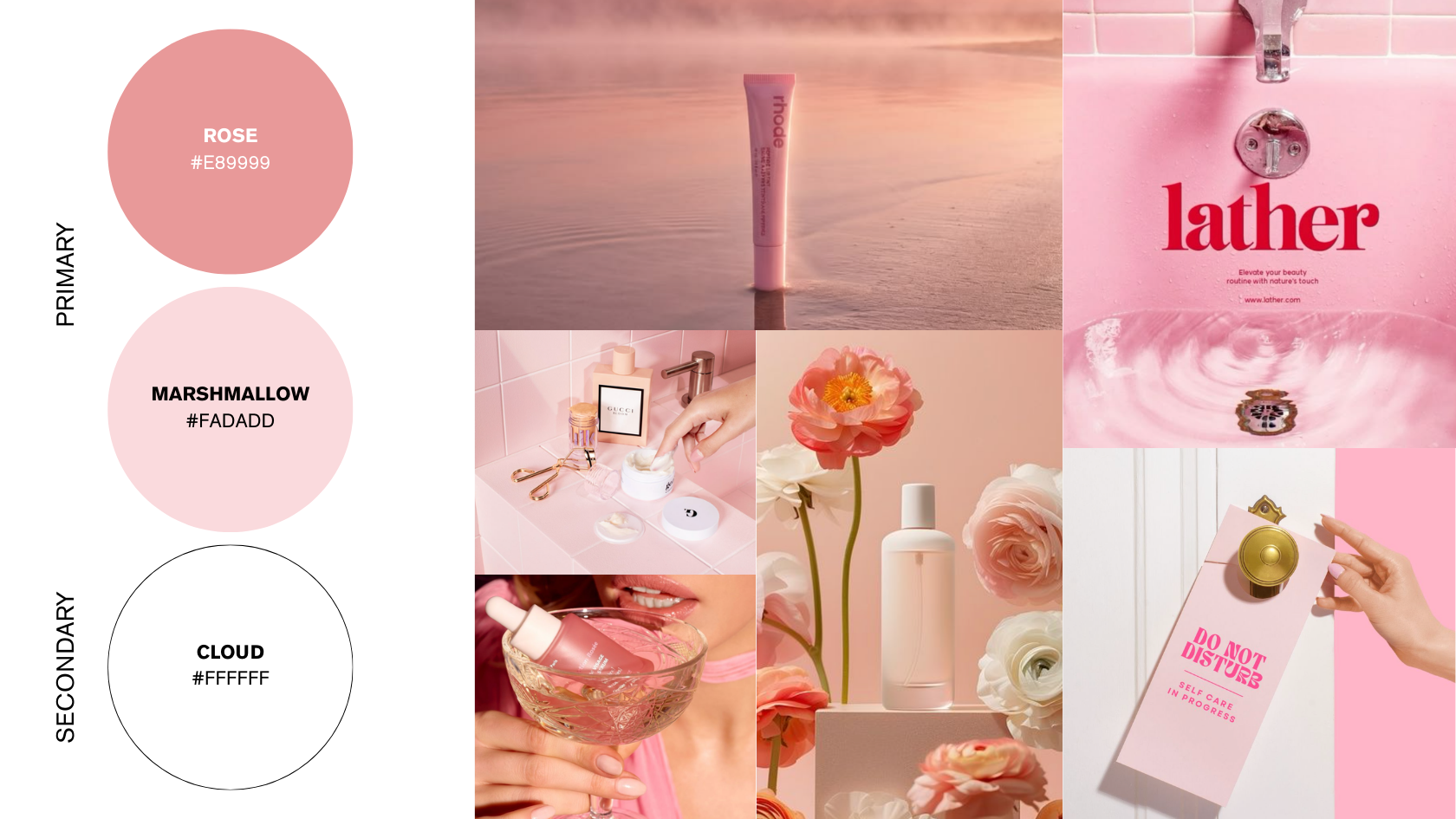
FOUR: PRETTY IN PINK
We often think of colour palettes in pairs or trios, but we are seeing fantastic things from monochromatic washes, specifically in this range of powder pinks and deeper rose tones. This isn't just one shade of pink, it's an entire gradient, giving depth and texture.
Why it works: A cohesive monochromatic palette feels sophisticated, confident and incredibly calming. Using different shades of the same hue (like a very light, almost white pink as the background and a richer, desaturated rose for typography and accent) allows you to use colour abundantly without overwhelming the eye.
Best For: Modern skincare, boutique fitness (especially yoga / pilates), high-end stationery and female-founded wellness spaces. It’s refined, gentle, and intentional.
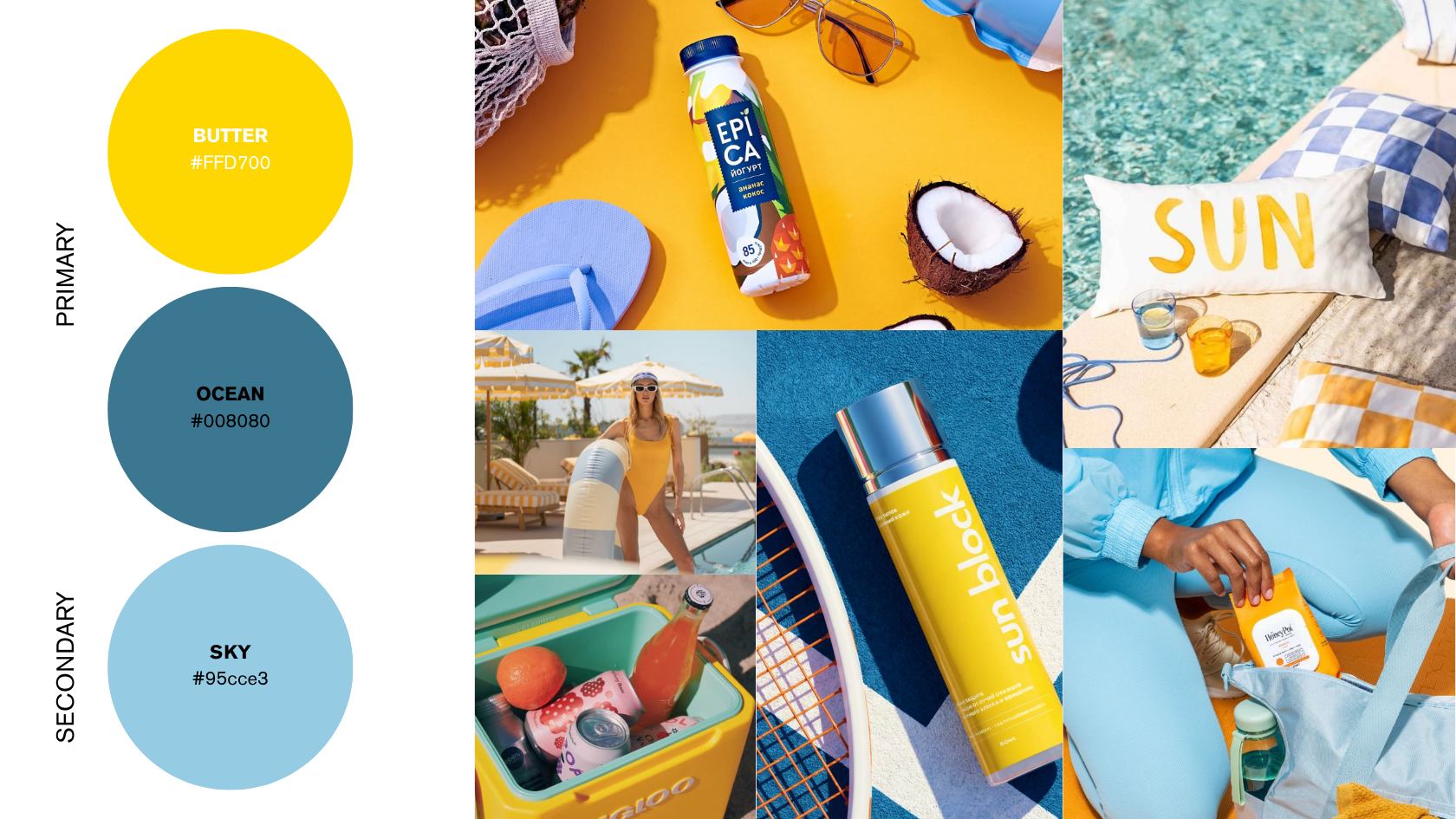
FIVE: THE SEASIDE
If you want summer in a brand, this is it… The pairing of a bright, hopeful, sunny yellow with a rich blue creates an engaging and dynamic brand personality. It’s the intersection of fun and optimism.
Why it works: Yellow is a powerful, attention-getting colour that immediately communicates joy and freshness. The blue anchors it, preventing the palette from vibrating too much.
Best For: Modern educational platforms, creative agencies, lifestyle accessories, skincare, drinks brands and travel agencies. This palette works beautifully to communicate that your business is approachable, bright and good at what it does.
FINDING YOUR PALETTE
Ultimately, the best brand palette is the one that authentically reflects your specific values, your unique mission and the exact emotion you want to evoke in your customer.
These are trends we’re seeing, but the application and customisation is everything. Pick the feeling you want your brand to evoke, and we can always help you find the perfect colours to showcase it.
Keen to start working on your new brand’s colour palette - or refresh one your brand already owns? Book your FREE 30 minute discovery call and let’s get to work.