

5 fonts we’re obsessed with this month (and why they work)
Typography is the silent ambassador of your brand. Before a customer reads a single word of your copy, the font has already told them if you are expensive or affordable, traditional or disruptive, serious or playful.
As we settle into 2026, we’re seeing a massive shift away from the bland-branding of the last decade. Brands are ditching safe, neutral sans-serifs in favour of typefaces with real soul and personality. Here are the five fonts we’re currently loving and why they are working so hard for modern brands right now.
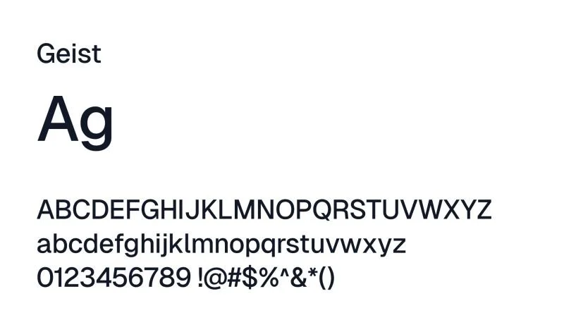
ONE. GEIST: The Digital Perfectionist
If your brand lives in the tech, SaaS, or high-end service space, Geist is the current gold standard. It’s a neo-grotesque font that feels incredibly pragmatic but also looks stunning in web animations.
Why it works: It’s built specifically for the digital age. It’s ultra-legible in dark mode and scales from a feather-light weight for minimalist headers to a punchy bold for data-heavy dashboards. It feels like the future, but a future that’s actually easy to read.
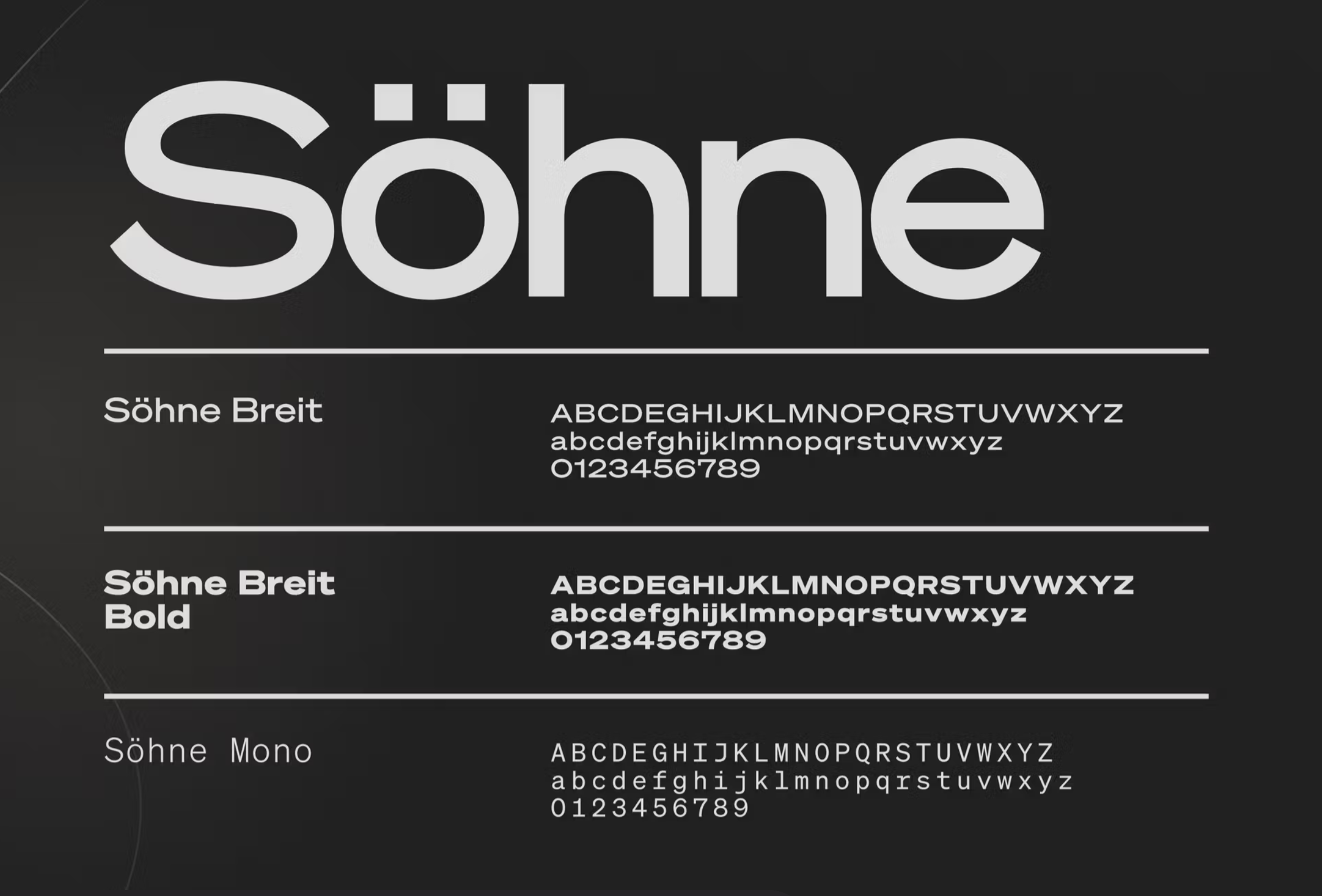
TWO. SÖHNE: The Contemporary Classic
Designed by NZ’s own Klim Type Foundry, Söhne is the typeface of the moment for brands that want to feel established yet current. It captures the spirit of old New York subway signage but polishes it up for 2026.
Why it works: It has a confident boldness that works perfectly for businesses that want to signal authority without looking stuffy. It’s the basic white tee of fonts: simple, high-quality and looks good on everyone.
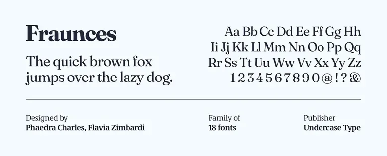
THREE. FRAUNCES: The Expressive Rebel
We are seeing a huge renaissance of soft, curvy, 1970s-inspired serifs, and Fraunces is leading the charge. This is the font for the anti-minimalists out there.
Why it works: It’s the ultimate versatile font when it comes to readability. Not only is it a readable book font in small sizes, but when you blow it up for a headline, it becomes lush, expressive and a little bit quirky. It’s perfect for hospitality, boutique retail, or any brand that wants to lead with feeling.
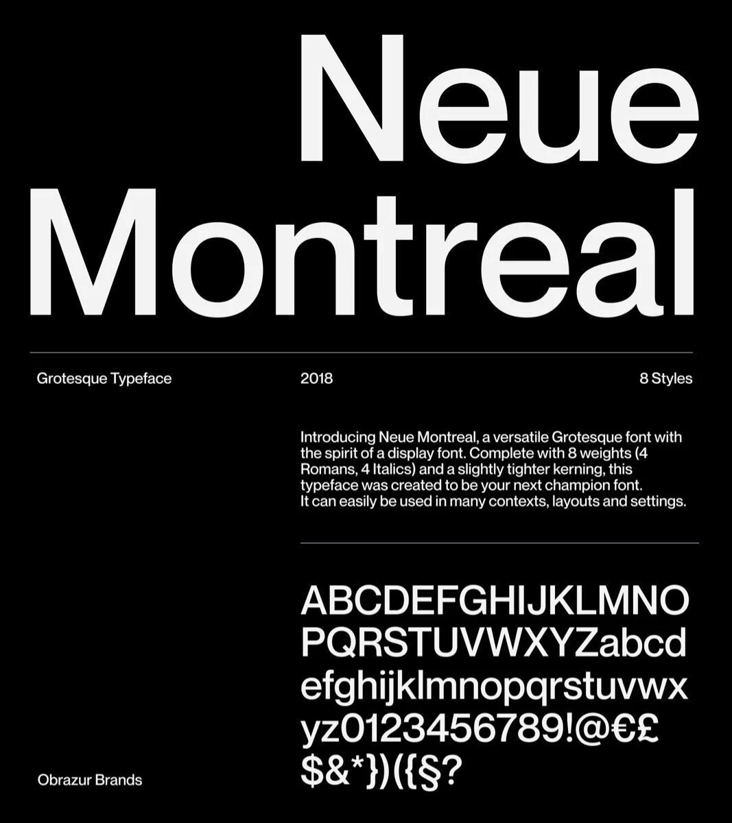
FOUR. NEUE MONTREAL: The Editorial Workhorse
Neue Montreal is a versatile grotesque font (so it essentially belongs to a group of sans-serif typefaces developed in the 19th century, which are considered functional and often bold in their design) that manages to feel like a high-end fashion magazine and a high-tech app at the same time. It’s timeless, leaning into that mid-century modernist aesthetic that never truly goes out of style.
Why it works: It has a extensive range of 14 weights, making it a dream for creating clear visual hierarchies on a website. It’s professional, balanced and gives off an air of quiet luxury.
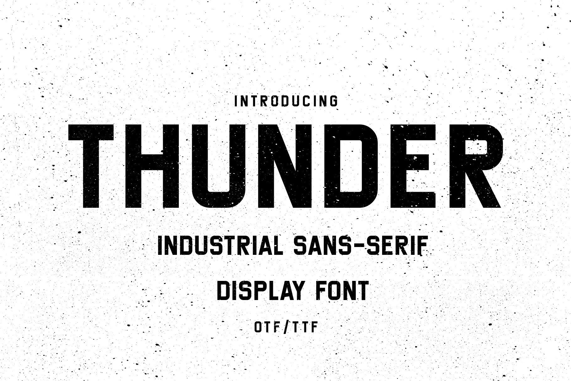
FIVE. THUNDER: The Attention Seeker
Sometimes, you just need to be loud. Thunder is a condensed, high-contrast typeface that is designed to take up space.
Why it works: In a crowded social media feed, Thunder stops the scroll. Its tall, narrow letterforms allow you to fit large, punchy headlines into small spaces (like Instagram Stories or Reels) without losing impact. It’s industrial, bold, and impossible to ignore.
Now of course these are the fonts we’re loving, but remember that the font you ultimately choose shouldn't just be about what looks cool, it should be a strategic decision based on your brand’s personality and the perception you want to curate for your brand.
Whether you’re building your brand from the ground up or embarking on a brand refresh, font selection will be one of the key decisions you’ll need to work through. Need help getting it right? Book your FREE 30 minute discovery call with us and let’s get working on your new brand identity!